>>
Industry>>
EdTech>>
How College Wayfinding Affects...How College Wayfinding Affects Enrollment Impressions
The Silicon Review
03 November, 2025
Author:
The Silicon Review Team
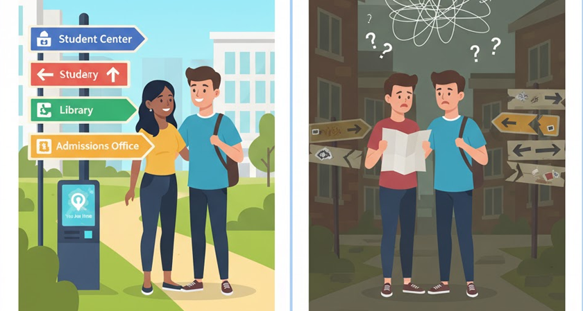
A campus tour starts long before the guide begins talking. The moment someone drives through the gate, they start forming opinions. Direction signs, paths, and entry markers quietly shape that first impression.
If visitors move easily, they relax. They stop worrying about where to go and start noticing what the campus feels like. That small shift makes a big difference.
Comfort You Can See
Wayfinding does more than point directions. It builds mood. Smooth movement tells students that the school knows how to organize itself. Confusing signs do the opposite.
When a family walks in from the parking lot and finds their way without asking anyone, the tone is already positive. It sends a quiet message: this place is ready for you.
Design That Feels Familiar
Modern students live in fast visuals. They scan instead of reading. Campus signs should reflect that pace. Big words, clean shapes, and consistent colors speak faster than paragraphs.
Bright hues can signal action. Muted tones can mark quiet or study spaces. A design that mirrors the rhythm of daily life feels natural. Nothing feels forced.
What Smart Campus Wayfinding Solutions Do
Strong campus wayfinding solutions tie the whole environment together. They blend digital kiosks, maps, and static signs into one pattern that’s easy to follow.
Digital screens update schedules and events. Fixed panels mark routes that never change. The two should support each other, not compete. When done right, visitors always know where they are and where to go next.
Small Details Students Notice
Students may not talk about signs, but they feel their impact. Every piece of the system adds to how the school is remembered.
- Color rhythm: Consistent hues connect paths, maps, and buildings.
- Placement: Signs belong at decision points, not just on walls.
- Readable text: Large, open fonts reduce hesitation.
- Friendly language: A tone that guides, not commands.
- Clean upkeep: Fresh paint and even lighting show care.
Each detail builds trust. Together, they create calm movement, which visitors interpret as competence.
How Movement Shapes Memory
People remember flow more than directions. If their first walk across campus feels smooth, that sense of ease sticks. A confusing route, even once, lingers longer than a good tour.
When parents or students get lost between parking and admissions, frustration clouds the visit. Clear guidance removes that tension. A visitor who feels oriented begins to picture life there.
Signs That Reflect Identity
A college sign system can speak the same way its programs do. A design school might use texture and creative layouts. A science campus could lean on structure and precision. Both can guide visitors while showing character.
Wayfinding works best when it fits the personality of the place. It’s not decoration. It’s part of the message. Every arrow, font, and map says something about what the school values.
Building for Change
Campuses grow. Departments move. Construction shifts the paths students take. A flexible wayfinding setup prevents chaos. Removable panels, updatable inserts, and replaceable arrows keep everything consistent.
That kind of planning signals responsibility. Visitors sense when updates look intentional, not rushed. It gives the impression of a campus that evolves with care.
The Quiet Power of Clarity
When a visitor walks from one end of campus to another without ever second-guessing direction, that’s design working quietly. The system has done its job.
No one praises a perfect wayfinding plan. They just remember feeling calm, organized, and welcome. That quiet comfort can be the difference between a student who leaves uncertain and one who decides to apply.