>>
Industry>>
Animation>>
Decorating with Black and Whit...Decorating with Black and White Art for a More Polished Interior
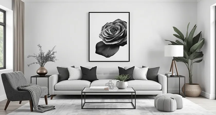
Black and white art has an unusual ability to make a room look more deliberate. Without color competing for attention, the eye begins to notice composition, proportion, texture, and contrast with greater clarity. That visual restraint can bring order to interiors that contain many materials, furnishings, and decorative objects. It can also sharpen a minimalist room by giving the space a defined focal point without introducing another color into the palette. The effect is particularly useful in homes where the goal is sophistication rather than ornament for its own sake. A carefully chosen monochrome work can make furniture, lighting, and architecture appear more considered because it gives the surrounding elements a stronger visual framework.
The appeal is not limited to minimalist interiors. Traditional rooms can benefit from black and white photography, drawings, or graphic prints because the limited palette introduces a contemporary note without requiring a wholesale change in style. In a transitional interior, monochrome art can become the bridge between antique furniture and cleaner modern pieces. Industrial spaces often gain warmth from expressive charcoal drawings or soft-focus photography, while Scandinavian rooms can use graphic black forms to prevent a pale palette from feeling too passive. Even colorful interiors can benefit because black and white provides a visual pause between stronger hues. Instead of competing with the room, the artwork can organize it.
Polish in interior design often comes from restraint and repetition rather than expense alone. A room feels composed when shapes, lines, materials, and tones appear to relate to one another. Black and white art makes those relationships easier to establish because the palette is already controlled. A black frame can echo a metal lamp, a dark fireplace surround, or the legs of a dining table. White space within a print can correspond to pale upholstery, plaster walls, or stone surfaces elsewhere in the room. These connections may be subtle, but they are often what separates a decorated room from one that feels professionally resolved.
Choosing Black and White Art With Visual Authority
The strongest black and white pieces tend to have a clear point of view. That does not necessarily mean choosing the boldest image available. A quiet architectural photograph can carry just as much authority as an oversized abstract composition if its scale and placement suit the room. What matters is whether the artwork has enough visual structure to hold its position on the wall. Strong silhouettes, confident lines, interesting negative space, and a deliberate tonal range all help a piece maintain presence. Before buying, it is useful to imagine the work from across the room rather than examining only its fine details.
Variety within the category is also important because black and white art extends well beyond photography. Ink drawings, architectural studies, abstract compositions, botanical works, and graphic prints can produce very different moods despite sharing the same restricted palette. Once the desired visual direction is clear, it can be useful to compare several mediums and subjects in one place rather than evaluating individual pieces in isolation. One place to make that kind of comparison is iCanvas, a Chicago-based wall art marketplace offering ready-to-hang work from independent artists, licensed estates, and cultural institutions across canvas, fine art paper, acrylic glass, wood, and metal. Browsing its black-and-white wall art illustrates how dramatically monochrome pieces can vary in texture, subject, composition, and visual weight. Seeing those differences side by side can make it easier to determine whether a room needs something atmospheric, graphic, architectural, or understated.
Subject matter should still relate to the atmosphere of the home, even when the palette is neutral. A dramatic city photograph may reinforce the sophistication of a tailored living room, while a loose botanical sketch can soften a bedroom furnished with straight-edged contemporary pieces. Abstract work is particularly useful when a room already contains recognizable decorative motifs and does not need another literal subject. Portraits can introduce personality and emotional weight, especially in hallways, libraries, or intimate sitting areas. Architectural images work well in spaces with strong millwork, masonry, or structural detailing because they emphasize line and geometry. The objective is not merely to match the artwork to the furniture, but to choose a piece that strengthens the character the room already possesses.
Use Scale and Proportion to Make the Art Feel Intentional
Scale is one of the most important distinctions between artwork that looks integrated and artwork that appears added as an afterthought. A small picture centered above a long sofa often leaves too much empty wall around it, which can make both the furniture and the art appear undersized. In many cases, one substantial work or a coordinated group occupying roughly two-thirds of the furniture width creates a more convincing relationship. The exact proportion can vary depending on architecture and ceiling height, but the principle remains consistent. Art should have enough visual mass to correspond with the objects beneath or around it. Black and white work is especially effective at larger sizes because its restricted palette reduces the risk that an oversized piece will overwhelm the room with color.
Oversized monochrome art can also correct awkward proportions in rooms with high ceilings or long uninterrupted walls. A large vertical work can emphasize height in an entry hall, stairwell, or narrow corner, while a horizontal piece can visually widen a dining room or living area. In open-plan spaces, substantial artwork can help define a functional zone without adding walls or architectural partitions. A large black-and-white photograph above a console, for example, can signal the beginning of a dining area even when it shares the same room with seating. The artwork effectively becomes part of the architecture. That is one reason designers often think about wall art in terms of spatial composition rather than decoration alone.
Smaller works require equal attention to scale, particularly when arranged in groups. A collection of modest prints can achieve the weight of a larger piece if spacing is consistent and the overall footprint relates to the furniture beneath it. The outer dimensions of the arrangement matter more than the dimensions of any single frame. Narrow gaps generally create a tighter and more formal composition, while wider spacing can feel casual and expansive. It helps to map the arrangement on the floor or with removable paper templates before putting anything on the wall. That simple step makes it easier to judge whether the group looks substantial enough from normal viewing distance. The goal is to make the installation read as one deliberate visual statement.
Build the Room Around Tonal Contrast
Black and white art may lack color, but it contains a wide range of tonal possibilities. Some works are dominated by deep blacks and sharp white highlights, producing strong contrast and graphic impact. Others rely on soft grays, shadows, fog, or delicate lines that create a quieter effect. Those differences should influence where the work is placed. A high-contrast image can energize a pale neutral room, while a softer grayscale piece may be more suitable for a bedroom or another space intended to feel calm. Choosing artwork by tonal character rather than subject alone often leads to a more cohesive result.
The existing contrast level of the room is a useful starting point. A space with white walls, cream upholstery, light oak, and pale stone may need a concentrated area of black to keep the palette from becoming visually flat. A bold monochrome artwork can provide that anchor without requiring darker furniture or a major renovation. Conversely, a room already containing black cabinetry, charcoal walls, or dark wood may benefit from a print with substantial white space. The lighter work creates relief and prevents the darker elements from accumulating too heavily. Effective decorating often depends on balancing visual weight rather than simply repeating the dominant tone.
Midtones deserve attention as well. Gray is frequently the element that allows black and white art to connect with materials such as stainless steel, concrete, weathered wood, linen, and natural stone. A photograph with a broad tonal range can therefore work particularly well in rooms built around layered neutrals. Soft grayscale imagery also tends to interact gracefully with changing daylight because the work reveals different details as the room brightens and darkens. At night, warm interior lighting may soften the contrast further and give the image an entirely different character. This ability to change with its surroundings gives monochrome art more depth than its apparently simple palette might suggest. The most successful rooms take advantage of that subtlety.
Frames, Mats and Materials Can Change the Entire Effect
Framing determines whether black and white art feels traditional, contemporary, casual, or architectural. A slim black frame produces a crisp outline that works particularly well with photography, typography, and graphic compositions. Pale wood frames introduce warmth and can make stark imagery feel more relaxed. Dark stained wood offers a more traditional presence and often works well in libraries, dining rooms, and interiors with vintage furniture. Metallic frames can add formality, although their finish should relate to the room's lighting fixtures or hardware. The frame should support the artwork rather than become a competing decorative event.
Matting is equally influential because it controls the visual distance between the image and the surrounding room. A broad white mat can make a relatively small drawing feel important by giving it generous breathing room. It can also create consistency across a group of unrelated works, which is useful for gallery walls. Black mats produce a more dramatic presentation but require care because they can visually compress the image. Off-white and warm ivory mats are often better choices in rooms with cream walls, natural textiles, or warmer woods. Even minor differences in paper tone become noticeable when the artwork itself is monochrome.
The material on which the image is presented also affects how refined the finished installation appears. Fine art paper emphasizes detail and usually feels appropriate for drawings, photography, and works that benefit from a traditional framed presentation. Canvas can give black and white imagery more physical texture and eliminate the reflective surface associated with conventional glazing. Acrylic glass creates a sharper, more luminous appearance that often suits contemporary interiors and high-contrast photography. Metal can intensify graphic imagery and work well in modern or industrial spaces. Wood introduces visible material character and may soften severe compositions. Selecting the right surface is therefore part of the design decision, not simply a production detail.
Adapt Black and White Art to the Purpose of Each Room
Living rooms usually require artwork with enough presence to compete with upholstered furniture, rugs, lamps, and conversation areas. A single large black and white piece above a sofa or mantel can provide a strong visual center without making the room feel overly coordinated. When the furniture already contains pattern, monochrome art can be particularly effective because it adds detail without introducing another set of colors. In restrained living rooms, a dramatic abstract or photograph can provide the visual tension the space needs. More traditional rooms may benefit from portraiture, landscapes, or architectural studies presented in substantial frames. The best choice is one that can hold attention from several viewpoints because living rooms are usually experienced from multiple positions.
Bedrooms typically call for a different approach. Highly graphic works can be striking, but softer images often support the quieter atmosphere expected in a sleeping space. Misty landscapes, line drawings, botanical studies, and low-contrast photography can provide visual interest without making the wall feel restless. Above a bed, the width of the artwork should relate closely to the headboard so the two elements read as a unified composition. Pairs of works can be especially effective because symmetry reinforces a sense of calm and order. Black and white art also pairs easily with changing bedding, making it practical for bedrooms where textiles are updated seasonally.
Dining rooms, hallways, home offices, and entry spaces offer opportunities for stronger choices. A dining room can accommodate art with greater drama because the space is often used for shorter periods and benefits from visual atmosphere. Hallways are well suited to series, photographic sequences, and salon-style arrangements because viewers encounter the work at closer range. In a home office, precise architectural photographs or structured abstract pieces can create a focused environment without adding distracting color. Entry halls benefit from artwork that establishes the tone of the home immediately. Since black and white works across many decorating styles, it can serve as a consistent thread between rooms even when each space has a different function.
Create Gallery Walls Without Making Them Feel Chaotic
A black and white gallery wall can bring significant visual interest to a room while remaining more controlled than a collection built around many colors. The limited palette allows different subjects, periods, and artistic styles to coexist with less friction. A family photograph can sit beside an abstract drawing, an architectural image, and a typographic print without the arrangement immediately feeling disconnected. Consistency can be strengthened through matching frames, similar mats, or repeated dimensions. Alternatively, varied frames can work if their finishes share an underlying relationship, such as black metal mixed with dark wood. The most polished gallery walls balance uniformity with enough variation to avoid looking mechanical.
Planning the composition is essential. One common approach begins with the largest or most visually powerful piece and builds outward from it. Another uses a strict grid, which is particularly effective with photography or a series of related images. Organic arrangements allow more variation in size and orientation, but they still need an invisible structure to prevent the wall from looking random. Keeping the distance between frames relatively consistent is one of the easiest ways to establish that structure. The eye notices spacing quickly, even when the viewer cannot explain why an arrangement feels balanced. Careful measurement usually produces a more sophisticated result than intuitive hanging alone.
The content of the gallery wall should also have a recognizable rhythm. Repeating dark areas across several pieces helps distribute visual weight rather than allowing one image to dominate the entire arrangement. White space can perform the same function by giving the eye moments of relief. Mixing photographs with drawings or text-based works can create depth, but too many unrelated techniques may weaken the composition. A useful approach is to limit the collection to two or three visual categories. For instance, architectural photography, abstract line work, and restrained typography can coexist comfortably because all three emphasize structure. Editing is often the final ingredient that makes a gallery wall appear curated instead of merely accumulated.
Coordinate Artwork With Furniture, Textiles and Architecture
Black and white art becomes especially convincing when it connects visually with the physical elements already in the room. The connection does not have to be literal. A photograph of a staircase might echo the vertical lines of nearby paneling, while a circular abstract composition might repeat the shape of a dining table or pendant light. These relationships create continuity that viewers tend to perceive instinctively. Repetition of line, shape, and proportion is one of the oldest tools in interior composition. Monochrome artwork makes those formal relationships easier to see because color is not competing for attention.
Textiles can provide another point of connection. A black stripe in a rug, dark piping on a chair, or a geometric cushion can visually link to a framed monochrome print elsewhere in the room. The repetition should remain restrained because excessive matching quickly feels staged. It is often enough for two or three elements to share a similar tone or graphic quality. Texture can also substitute for color coordination. A charcoal drawing, for example, can relate beautifully to wool, bouclé, plaster, unfinished wood, or heavily woven linen because all of those materials have a visible tactile character.
Architecture should ultimately take priority over decorative rules. Art hung between windows should respect the available wall width, while work placed above millwork or a mantel should respond to those existing lines. Crown molding, ceiling height, doors, niches, and built-in shelving all influence the amount of visual space a piece can occupy comfortably. In older homes, black and white artwork can create a productive contrast with ornate architectural details. In newer spaces, it can reinforce clean geometry and bring definition to otherwise blank surfaces. Treating the architecture as the framework ensures that the art looks integrated with the room rather than simply attached to it.
Use Lighting and Placement to Give Monochrome Art Lasting Impact
Lighting can significantly alter the way black and white art is perceived. Strong directional light increases contrast and may emphasize texture, while diffuse illumination tends to reveal a broader range of gray tones. Natural daylight can be particularly effective with photography and works on paper because it allows subtle detail to emerge gradually throughout the day. Direct sunlight, however, can be damaging to certain materials and should generally be avoided for valuable or delicate works. Placement near a window may still work if the wall receives indirect rather than sustained direct light. Thinking about illumination before hanging the art prevents later compromises.
Artificial lighting deserves the same attention. Picture lights can create a traditional, intentional presentation, especially above framed works in libraries, dining rooms, or formal living spaces. Adjustable ceiling spots are useful for larger contemporary pieces because the beam can be directed without adding another visible object to the wall. The color temperature of the bulb also matters. Very cool lighting may make white paper look blue, while excessively warm light can give it a yellow cast. A balanced warm-white source often works well in residential interiors because it preserves contrast while remaining comfortable. Glare should also be checked from the primary viewing position, particularly when the work is behind glass or acrylic.
Placement ultimately determines whether the artwork feels connected to everyday life in the room. Pieces should generally be positioned in relation to human sightlines and nearby furniture rather than automatically centered on the wall itself. Artwork above a sofa, console, headboard, or credenza usually looks more cohesive when it sits close enough to the furniture to form a visual group. In passageways, the viewing distance may be short, which makes smaller detailed works more rewarding. In large rooms, bolder imagery is often necessary because the art will be seen from farther away. Black and white art rewards this kind of careful planning because even small adjustments in height, spacing, and light can sharpen its impact. When those decisions are handled thoughtfully, monochrome artwork does more than fill a blank wall; it helps give the entire interior a more disciplined and polished identity.













Comments