>>
Industry>>
Management consulting>>
Why Print Buyers Are Getting P...Why Print Buyers Are Getting Pickier About Paper Stock
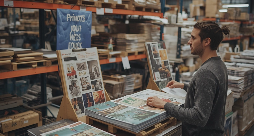
A buyer sent back her third paper sample last month. Not because the color was off. Because the cover felt flimsy in the hand, and she knew her client would notice within two seconds of opening the mailer. That reaction is becoming normal. Ten years ago, most people ordering a catalog or a program just asked for "glossy" and moved on.
Now they ask about cover weight, text weight, whether the inside pages will show through to the other side, and whether a perfect bound book needs a coated cover at all. Paper stopped being a footnote. It became the decision. I think that shift is healthy, even when it makes my job slower. Here's why it's happening and how to make the call yourself without turning it into a week-long project.
What Actually Changed
Three things, and none of them are mysterious. First, print runs got smaller. When you print 5,000 pieces, a slightly cheap stock gets forgiven because the volume carries the impression. At 250 or 500 pieces, every sheet is on display, and a thin cover reads as cut corners. Buyers noticed.
Second, digital presses changed what's economical to offer. Short runs now make sense on machines built for them, which means small orders can get the same stock menu that used to be reserved for big offset jobs. More options, more chances to choose wrong, more people asking questions.
Third, mail and shelf space got more expensive. If it costs real money to ship a piece and get it into someone's hands, the piece itself needs to survive the trip and look intentional when it lands.
Cover Weight Is Where Most Orders Go Wrong
Here's the part buyers get wrong most often: they treat the cover as a design choice when it's really a durability choice. An 80 lb cover stock is fine for a program handed out at an event and thrown away that evening. A 100 lb cover is what you want if the piece sits on a desk, gets mailed, or gets flipped through by more than one person. That difference is small on a spec sheet and obvious in a hand.
Self covers are the other trap. A self cover means the cover is printed on the same paper as the inside pages, which saves money and works for zines, workbooks and anything with a deliberately plain feel. It also means no coating, because coating on a text-weight sheet doesn't behave the way people expect. If you want a soft touch or spot UV finish, you're choosing a plus cover whether you said so or not. A booklet's cover is the only part a reader is guaranteed to touch. Budget accordingly before you budget for anything else.
How to Choose Stock in Under Ten Minutes
Stop browsing paper swatches like you're picking paint. Work through these five questions in order and the answer usually falls out on its own.
- How does it travel? Handed out in person, mailed flat, mailed in an envelope, or stacked on a counter. Mailing demands a heavier cover.
- How many pages? Page count drives binding, and binding drives cover weight. Thin books tolerate light covers. Thick books don't.
- Will anyone write on it? Workbooks and manuals need uncoated text stock so pen ink doesn't smear. Coated sheets fight ballpoints.
- Does it need to sit flat? Coated covers resist curling better over time, which matters if it lives on a shelf.
- What's the budget ceiling per piece? Set it before you fall in love with soft touch, then work backward.
If you answer those five honestly, you'll land on one or two real options. That's the goal. A menu of twelve stocks isn't a service, it's a delay.
Binding Changes What Paper Can Do
Two staples through a fold and a glued spine have completely different relationships with paper.
Saddle stitching folds sheets in half and staples them at the spine. It's fast, it's inexpensive, and it works inside a page range that fits multiples of four, generally from 8 pages up to the low 50s. The catch is that thick saddle stitched books can show a slight bow at the spine, and heavy cover stock makes that worse.
Perfect binding glues the pages into a square spine, which is what you see on most paperbacks. It handles higher page counts more gracefully and looks more like a book on a shelf. It also punishes a weak cover, because the spine carries weight every time someone opens it. According to long-running data from the U.S. Census Bureau, the printing industry remains a substantial employer across the country, and that scale exists partly because buyers keep demanding tighter physical specifications rather than looser ones. My rule: if the piece needs to look like a book, go perfect bound and spend the extra money on the cover. If it needs to be cheap, fast, and stapled, don't pretend it's a book.
The Coating Question, Settled
Coatings are where estimates quietly drift over budget.
- Gloss aqueous and dull aqueous are the workhorses. Cheap, fast, protect the ink, and dull reads more premium than people expect.
- Flood UV gives a high-shine finish across the whole cover. It's a look, and it's not subtle.
- Spot UV shines only where you place it, which is great for logos and titles and terrible for anything with fine type.
- Soft touch is the one clients ask for by name after feeling it once. It also shows fingerprints and scuffs more than any other finish, and it costs more.
None of this applies to self covers, so if you've already decided on a self cover, skip this section entirely and put the money into page count instead.
Where Small Operations Win
Most business owners assume printing has consolidated into a handful of giant plants. It's more mixed than that. Small operations still hold real ground, and the U.S. Small Business Administration has documented for years how much of the economy runs through firms with a few dozen employees or fewer.
That matters to you as a buyer because a small press can keep a job in one building. Printed, bound, and trimmed under one roof means fewer handoffs, fewer chances for the wrong stock to show up, and a person who actually remembers your last order when you call.
The professional standard behind that consistency comes from organizations like the IEEE, whose members have spent decades formalizing how print and imaging systems are measured and specified. Ask any printer one question before you commit: does this job leave your building? If the answer is yes, ask where it goes. You're allowed to care.
The Framework I Use
I call it the Three Touches rule, and it's the fastest way to decide if a spec is good enough.
Picture the piece getting touched three times: once when it's picked up, once when it's opened, and once when it's set down or passed to someone else. If your chosen stock survives all three without curling, creasing, or feeling disposable, you picked right. If it fails any one of them, go heavier on the cover.
It sounds soft, but it's more reliable than staring at a spec sheet. Paper is a physical product, and your buyer's hand is the actual test.
The downside of getting pickier is that orders take longer to finalize. The upside is that you stop reprinting things that didn't hold up. Given the choice, I'll take the slower conversation every time.
So before you send the next job to press, hold a physical sample. Not a screen. Not a PDF. Your hands will tell you in five seconds what a spec sheet never will. What does your current booklet feel like when someone picks it up?




















Comments